Corbu
Architects, Urbanists, and Interior Designers need a reliable source of projects and references, when they could learn aspects little exposed in mainstream architecture magazines.
Year
2019Client
N.A.Platform
WebDesign Tools / Methods Used
Competitive Analysis, High-Fidelity Prototype, Adobe XDMajor Tasks and Responsibilites
N.A.Team Members and Collaborators
N.A.Context
Architects, Urbanists, and Interior Designers need a reliable source of projects and references, when they could learn aspects little exposed in mainstream architecture magazines, such as inspirations, architectural concept, and learning about the intentions and solutions of the author.
Objective
Create a web based Architectural Blog app that receive and curates Architectural, Urban and Landscape Projects and Photos Essays, where Designers share they intentions and decisions about the featured project.
Competitive Analysis
I'd started this project looking for existing Architecture Magazines, to understand how these companies show projects and how good they are to deeply understand concepts and decisions in Architecture.
I chose 3 most solid magazines: Archdaily, Divisare and Dezeen.
Archidaily
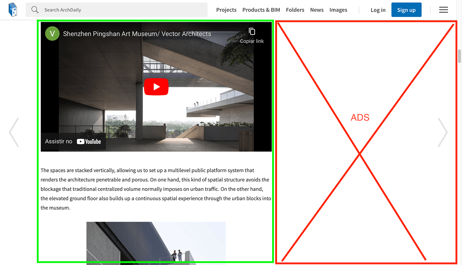
It's the most well-known mainstream Architecture magazine. Archdaily tries to reach the most user profiles, not only architects, but general people which likes to read about. Archdaily's mission it's about all the people can and will contribute to create better cities, this is why the mainstream approach.
But the same mainstream approach means that deeper texts about architecture will not be found here, only general info about the project and some major decisions.
It can be seen how little space the project content has in the page, almost half of the screen is dedicated for ads.
Divisare
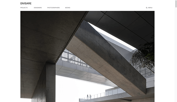
Divisare is what called an “architecture atlas”, where architects write for architects, so they write to show and teach deeper meanings about concepts, space, materials, history. “Instead of a quick, distracted web, we want a slow, attentive one. Instead of hastily perused information, we prefer knowledge calmly absorbed. This is why Divisare is a place to perceive architecture slowly, without distractions.”
Since Divisare's revenue comes from subscriptions, there are no ads in the site.
Divisare is the best example and reference that supports our direction for this project.
Dezeen
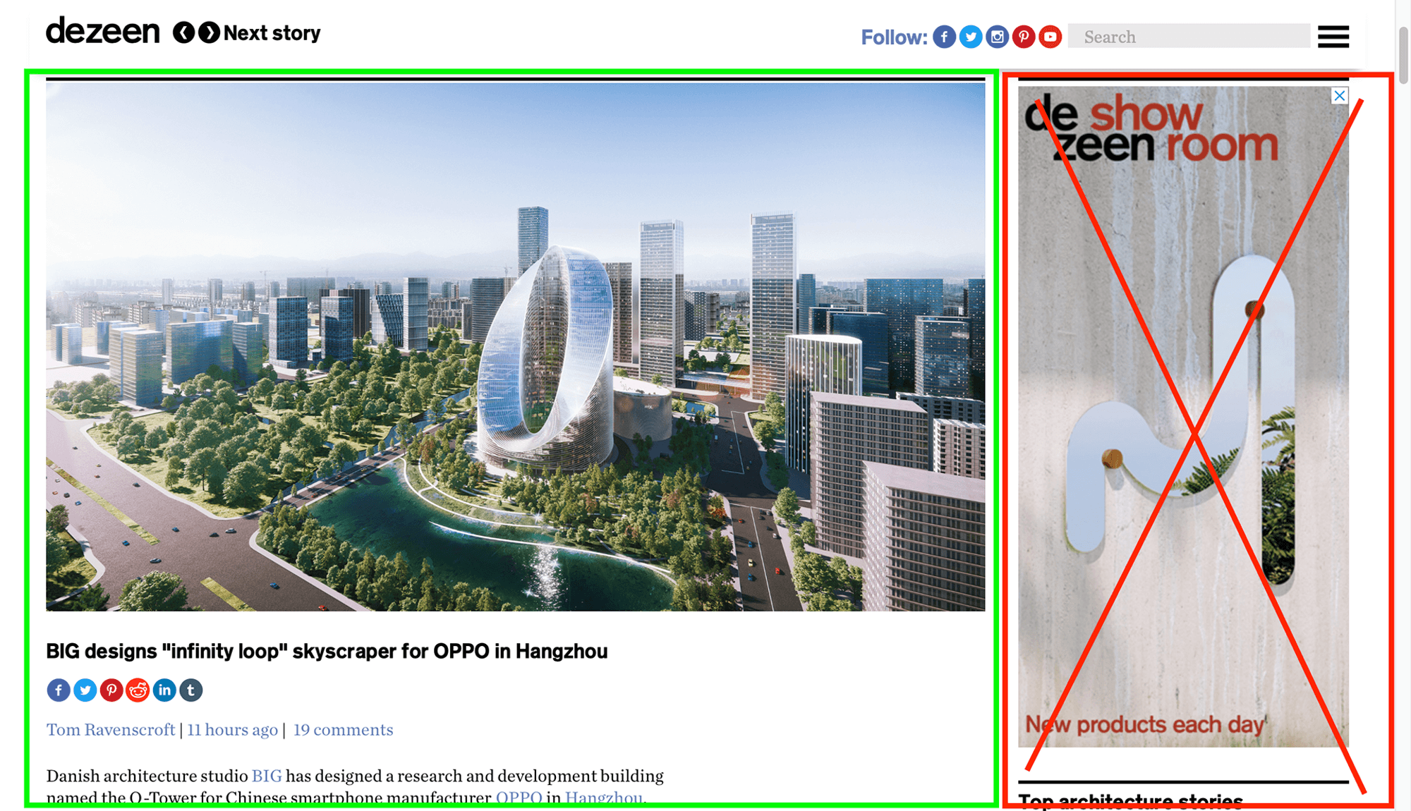
Another mainstream magazine. Not only the projects are shown only for visuals and generic info, the texts are made for journalists, not architects.
Insights
Divisare will be our grand reference.
The search engine needs to be comprehensive and complex. Because Architects and students may need to search by designers, materials, cities, solutions, concepts, etc.
It's possible to bring content without distractions and ads. This atlas will be part of studies and needs to be clean as possible.
Proposed Solution
Corbu is an Architectural Blog app that receive and curates Architectural, Urban and Landscape Projects and Photos Essays, where Designers share they intentions and decisions about the featured project. Corbu is an Atlas of Architecture, with a thousand of projects all around the world, bringing knowledge, reference and (something else) of others designers and students.
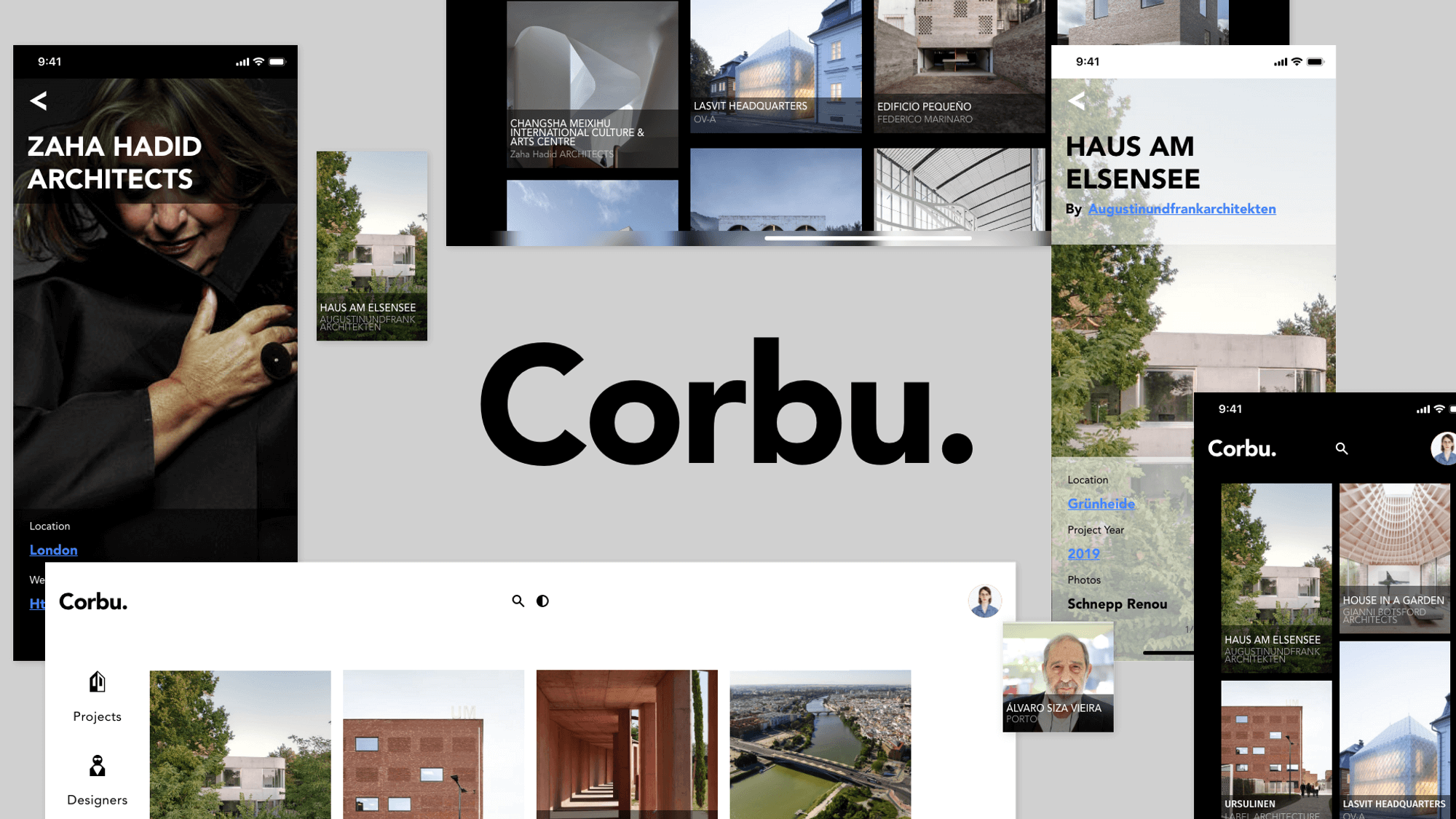
Corbu's brand uses extremely minimalist color, shape, and typography to express its brand attributes: distractionless, contemporaneity.
Corbu's Aesthetic
Corbu’s design provides a distraction free, slow attention for what really matters: Architecture. Knowledge calmly consumed. Corbu's branding have its own personality and that is expressed, but also respect each piece of art inside its content.
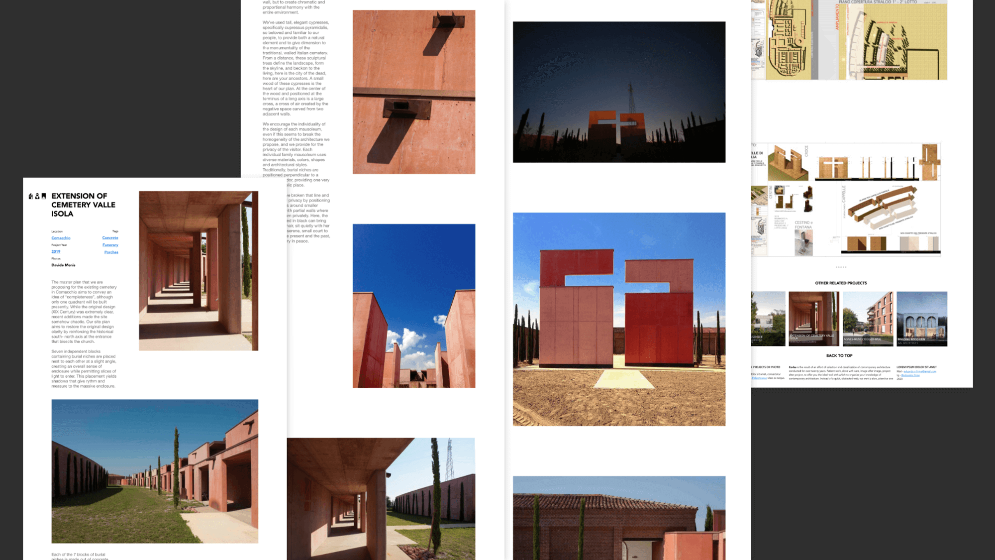
The UI contains rectangular and definite shapes that establish a defined boundary between app and content, the cards are windows inviting to explore.
Product Architecture
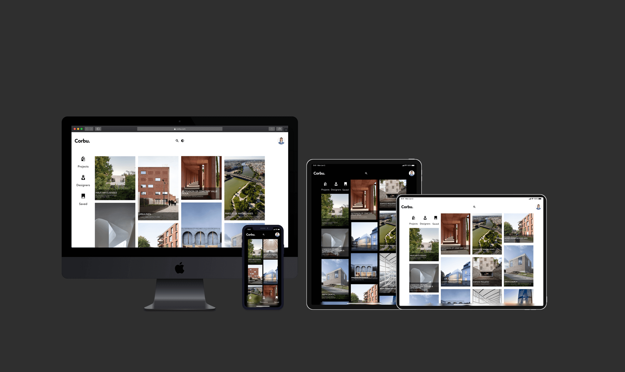
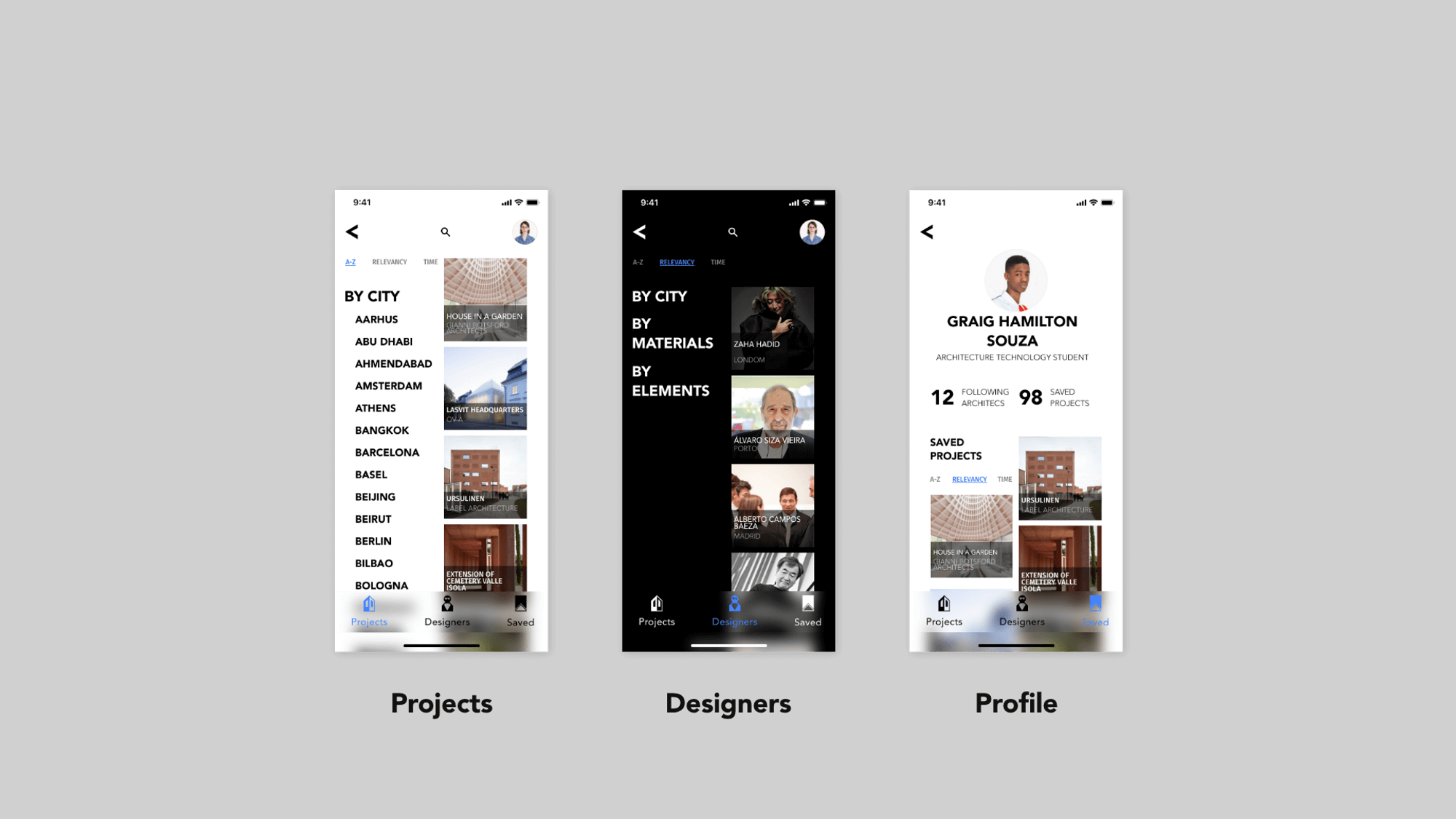
Corbu's home page shows projects recently added to the library, and the app is divided in three sections: Projects, Designers, and Profile.
Section 1 - Projects
This section brings the library of projects, where you can search and browse for projects. The content are cataloged by in three lists: City (project's location); Materiality (materials, textures, and color) and Elements (relevant architectural elements in the project)
Section 2 - Designers
This section brings the studios cataloged in three lists: City (location of the designer's studio); Materiality (materials, textures, and color commonly used by the studio) and Elements (architectural elements relevant by the designer's signature)
Section 3 - Profile
This section stores all the projects that the user liked and bookmarked for easy access.
Layout
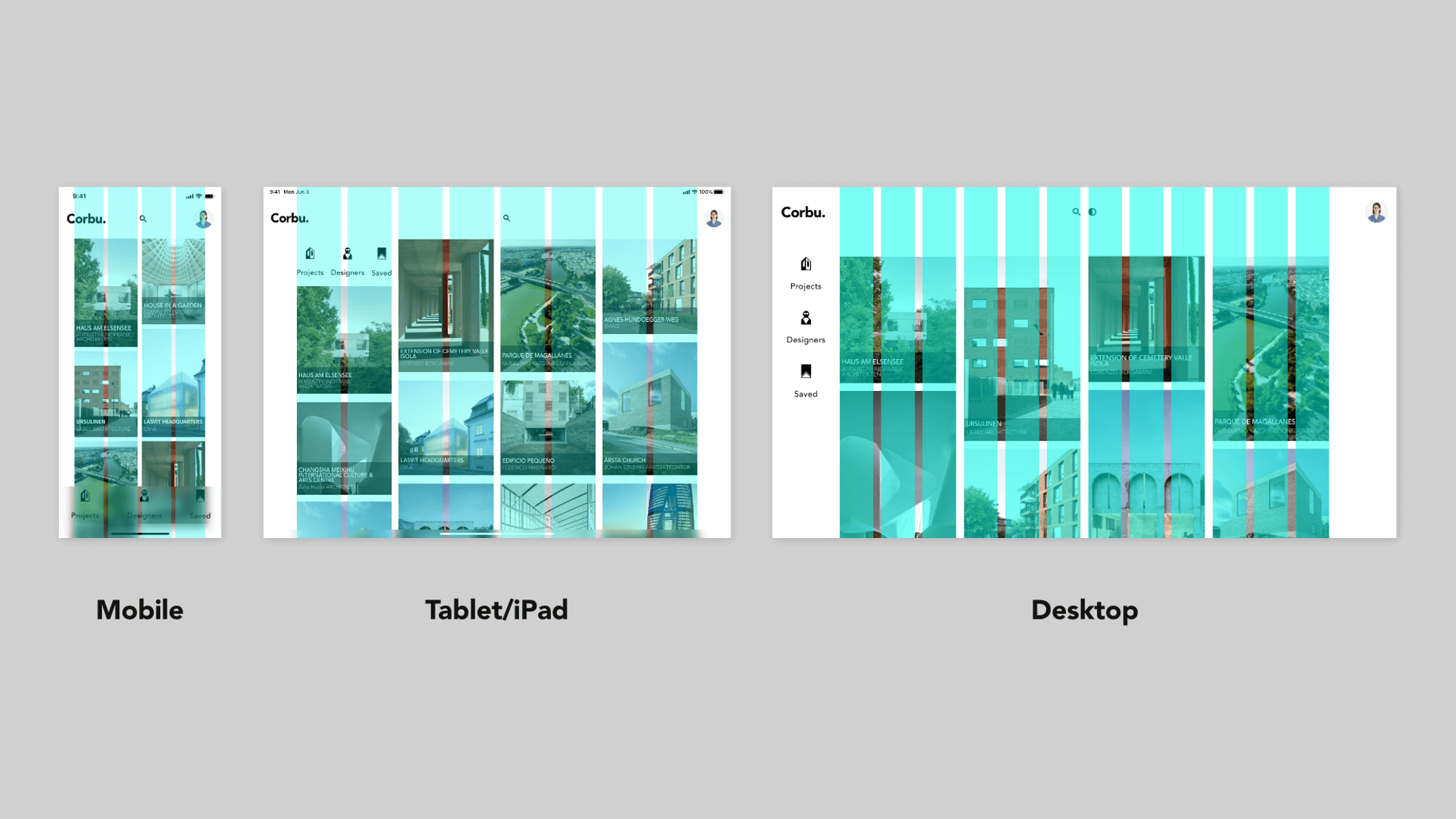
Corbu uses a responsive grid system, which has flexible columns and padding that can resize depending on the screen width (such as mobile, tablet, or desktop).
Color
The color “palette” reflect the minimalist approach evoking the content.

Typography
Corbu's type scale provides the typographic variety necessary for the app content. All items in the type scale use Avenir as the typeface, and make use of the variety of weights available.
Component
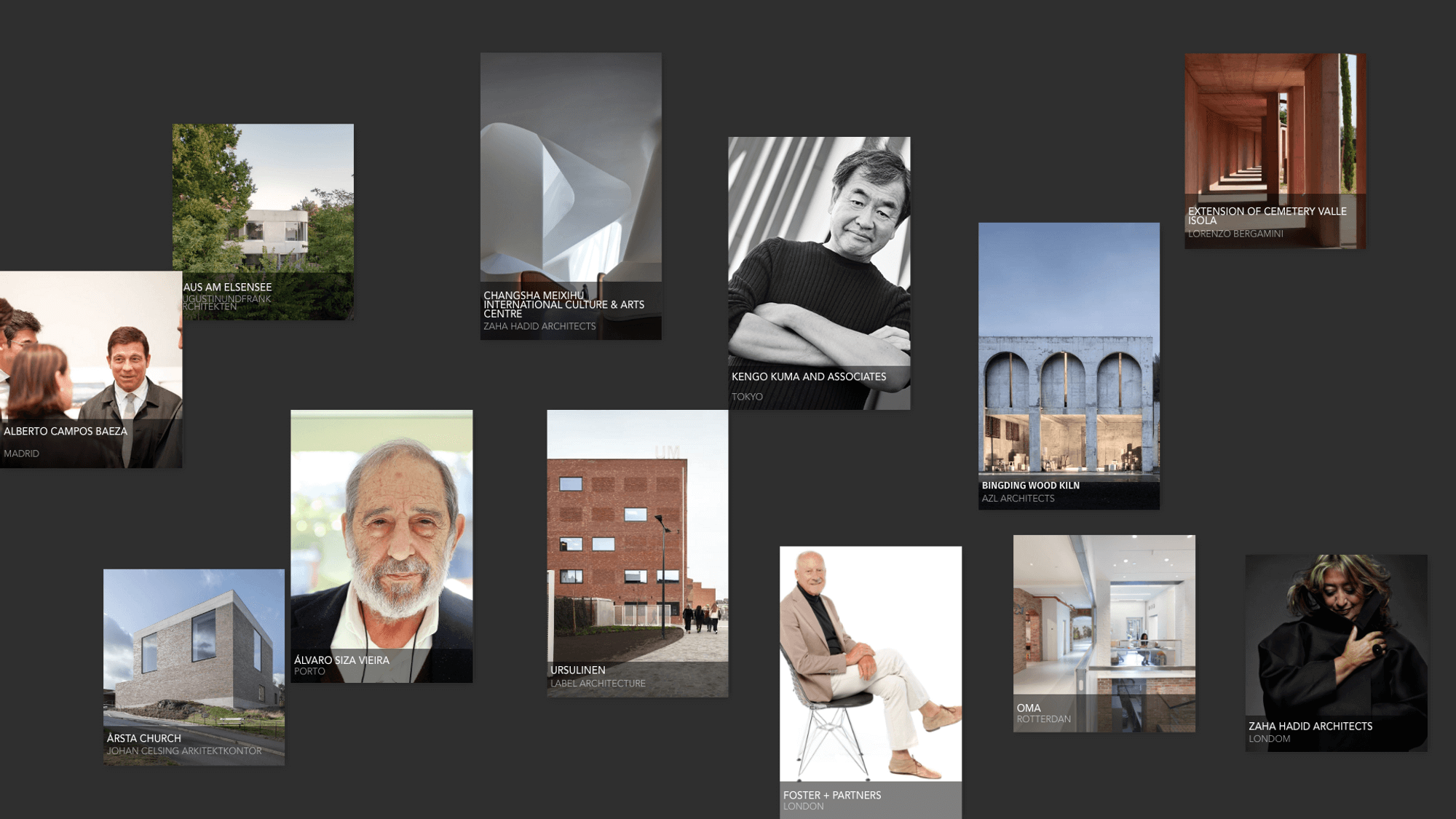
Cards
Corbu's featured content are presented using a card collection. They share a consistent shape, color, typography, and iconography, with left-aligned content. There is little padding between cards, and the collection uses a masonry pattern (where cards have varying heights).
Lists
Corbu's "cards" are cataloged and can be filtered by lists
Bottom Navigation
Corbu's bottom navigation component has custom color, typography, and iconography. Also define the app sections.
Conclusion
This case made me learn how to write cases. I didn't know how to write a project, and Corbu was my first personal case to feed my portfolio. So I found some examples of projects made in Material Design on the Material.io website itself like the Owl project, and then I decided that that case format would be ideal for Corbu.
Making this case for learning more about UI and UX, and having my architecture background as a theme was a lot of fun.